Color is often the very thing that draws us to painting in the first place — yet it’s also one of the biggest sources of frustration for artists at every level. Even experienced painters sometimes find their work looking flat, muddy, or oddly “off,” without fully understanding why.
If you’ve ever stepped back from a finished piece and felt that something was missing, chances are the issue wasn’t your subject or your drawing skills. It was your color.
And you’re not alone — artists everywhere share the same struggles.
Why Color Can Feel So Complicated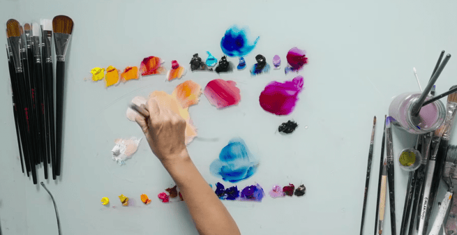
Many painters assume color will come naturally with time, but the truth is, without a deeper understanding of how color behaves, it’s easy to run into the same problems again and again:
-
Paintings that lack life or feel “dead” even with strong composition
-
Fear around choosing or mixing colors
-
Uncertainty about how to make certain areas stand out
-
Difficulty achieving depth, mood, or atmosphere
-
Inconsistent results from one painting to the next
-
Accidental muddy colors that dull your entire piece
These struggles don’t come from lack of talent — they come from missing information. And often, it’s information artists never even realized they needed.
The Secret Behind Paintings That Glow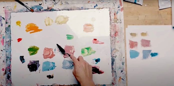
When you see a painting that seems to glow — where colors feel rich, balanced, and full of movement — you’re witnessing more than good color choices.
You’re seeing:
-
Intentional relationships between pigments
-
A palette built with purpose, not guesswork
-
Color used as both structure and emotion
-
A clear understanding of how warmth, coolness, and contrast guide the eye
These principles aren’t mysterious, but they’re also not usually explained clearly in typical art classes. That’s why so many artists feel stuck, even after years of experience.
Color isn’t just a visual component — it’s the engine of your painting.
12 Practical Color Theory Tips Every Artist Should Use
1 - Limit Your Palette for Stronger Harmony
Choose only a handful of colors for each painting. Fewer pigments force your mixes to stay unified and prevent accidental chaos.
2 - Arrange Your Palette the Same Way Every Time
A consistent layout speeds up your mixing, reduces mistakes, and helps you memorize how your colors behave.
3 - Test Your Colors Before You Commit
Always swipe a small mix on scrap paper or a palette edge. Seeing it in action prevents muddy surprises on your canvas.
4 - Warm a Color to Bring It Forward
If an area feels too flat, shift the temperature slightly warmer — even by a tiny amount — to make it appear closer to the viewer.
5 - Cool a Color to Push It Back
A subtle cool tone instantly creates depth. Use cooler versions of your colors in the background or shadow areas.
6 - Pair a Saturated Color With a Neutral
Put something bold next to something quiet. This contrast makes your vibrant color sing without you having to increase intensity.
7 - Keep a Clean Brush When Mixing Light Colors
Dark pigments overpower lights instantly. Start with a clean brush (or palette knife), then add dark slowly if needed.
8 - Mix With a Palette Knife to Avoid Mud
Your knife doesn’t hold leftover pigment the way a brush does. When precision matters, knife-mix — then apply with the brush.
9 - Step Back Regularly
Color decisions often look different from a distance. Stand back every few minutes to evaluate the overall temperature, balance, and transitions.
10 - Use Small Pops of High Saturation
Save your most intense colors for key moments — especially the focal point. A tiny area of brilliance is more powerful than flooding the whole canvas.
11 - Check Your Color Relationships in Black and White
A quick phone photo in grayscale shows whether your values support your color choices. If the value structure works, your colors will too.
12 - Keep a “Rescue Neutral” Nearby
Have a reliable neutral on your palette that can tone down any color gently—perfect for softening transitions or correcting an overly intense mix.
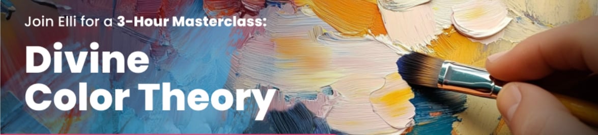
Discover the Missing Link: Divine Color Theory
If you’re tired of muddy results, lifeless color, or inconsistent mixes, the Divine Color Theory Masterclass will show you the secrets most artists never discover — even after years of study.
It’s clear, it’s practical, and it’s unlike any color class you’ve ever taken.
👉 Explore the Divine Color Theory Masterclass
More Articles